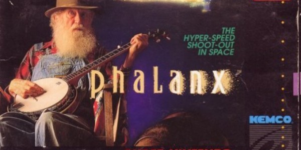
As gamers continue to educate themselves with online resources before making pricey game purchases, videogame box art becomes more and more unimportant. Box art used to be the main selling point, and also provided the narrative background for the games they were representing. Developers used to be limited to a small number of colored squares to build their games, so what they lacked in graphical presentation, they made up for with amazing box art.
Some studios have entirely abandoned box art, relying on a very specific template or just ignoring the content of the game entirely, in favor of something that looks kind of scary (e.g. Deadly Premonition). 2010 was ripe with all sorts of wonderfully terrible box art for high profile games. Here are the worst.
Deadly Premonition

Deadly Premonition could have been an incredible game, if only it wasn’t so terrible. The game had a lot of problems, but it had an endearing quality and interesting characters that sort of made the experience worthwhile in the long run. This cover art, though, does almost nothing to represent what Deadly Premonition is.
The game is beyond bizarre for a milion reasons. The lead character drinks coffee with psychic powers while solving a small town murder mystery involving deadly red seeds. Why didn’t they capitalize on that strangeness and offer a cover that is equally as strange? Of course, the entire Deadly Premonition experience is filled with nothing but “Why didn’t they…?” throughout, so a terrible cover is not that much of a surprise.
Goldeneye 007

The team behind Goldeneye 007 for the Wii must have understood the reverance associated with the name “Goldeneye,” becasue that is the only thing interesting about this box. If there were any other name on the box, the educated consumer would have blindly assumed that this was a budget title that was trying to sell itself on the fact that it has guns in it.
Daniel Craig was clearly involved in the project. Why not have him on the cover? They could have just used the same exact cover from the N64 classic and put a little asterisk by Pierce Brosnan’s head with a note reading, “Game does not actually feature Pierce Brosnan.” That would have been a lot more interesting than the silhouette they opted for instead.
Splatterhouse

Splatterhouse is not a good game, and the box art for the game stays in line with the low quality product. It does accurately represent the game, one could argue. The box art is boring and involves a lot of blood. That’s a pretty apt description for the game. Boring and bloody.
God of War III

Imagine a world where the successful video game franchise God of War is unknown. Now imagine a world where you saw this game on a shelf. Okay, there is a face… and an eyeball. Apparently the person wearing this face likes to apply white makeup and goes a little overboard on the mascara. Are you a theatre actor in this game? Maybe a member of Cirque du Soleil? Is this a Cirque du Soleil game?
There are a million options that could have made this box art better. A screenshot from literally any moment of the first 20 minutes of gameplay would have been more interesting than Kratos’ eyeball.
Castlevania: Lords of Shadow

The final few examples, including that of Castlevania: Lords of Shadow, don’t necessarily represent bad box art; they simply fall under the “generic box art” umbrella.
Much in the same way lead actors of films are often heavily represented on the posters of their films, video games elect to feature their lead characters on the covers of thier games, all in the same pose. It’s the, “I’m sort of sad, but want to look cool, and am sort of looking right at you, but not really at the same time,” pose.
Dante’s Inferno

The similarities between the Castlevania: Lords of Shadow and Dante’s Inferno boxart are uncanny. Both feature characters that are looking at the viewer (but not really looking at the viewer), both look sort of sad and both have crosses attached to their hips. They both even seem to have an affinity for the color red.
Fallout: New Vegas

Here is yet another example of the sad-but-cool pose. He (or she) could be smiling under that mask for all we know, but the mask just looks like a sad face. Also, it’s worth noting that the only reference to Vegas (other than the city’s appearance in the title) is a small little cityscape in the bottom corner of the screen that is practically obscured by the ESRB rating. Huge missed opportunity here, folks.
Most of the above games were at least fairly successful. Some did better than others, but their measure of success quite likely had little to do with their box art. Modern gamers, the ones who wait in line at midnight for God of War III or Fallout: New Vegas, know what they are getting into with their $60 investment well before the game even releases. The box art is marveled over momentarily from the store on the way to the car in the parking lot. After that, the game is typically placed on a shelf with the only visbale cue to it’s content being the title written on the spine. Box art just isn’t as importatnt as it used to be, and it’s a damn shame, but not as shameful as these covers from 2010.


